
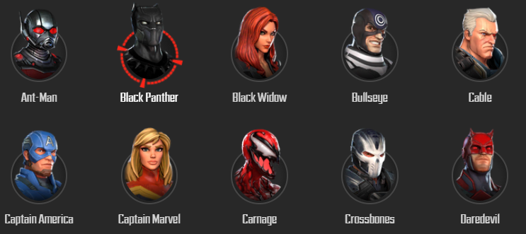
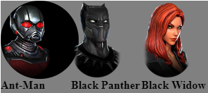
Issue
This is the circular effect I trying to reproduce. There is a grey circle and a animated spinning red reticle when hover over the picture.
I try with border-radius but didnt work.
.container {
  display: grid;
  grid-template-columns: 100px 100px 100px;
  grid-template-rows: 150px 150px;
  background-color: gray;
}

.sprite {
  background-image: url(https://msf.gg/static/img/roster.abdfcf1.png);
  background-repeat: no-repeat;
  display: block;
}

.bg-Ant_Man {
  width: 111px;
  height: 111px;
  border-radius: 100%;
  background-color: black;
  background-position: 0px -555px;
}

.bg-Black_Panther {
  width: 73px;
  height: 111px;
  background-position: 0px -777px;
}

.bg-Black_Widow {
  width: 73px;
  height: 111px;
  background-position: 0px -888px;
}

.bg-Bullseye {
  width: 73px;
  height: 111px;
  background-position: 0px -999px;
}

.bg-Cable {
  width: 73px;
  height: 111px;
  background-position: 0px -1110px;
}

.bg-Captain_America {
  width: 73px;
  height: 111px;
  background-position: 0px -1221px;
}

.bg-Captain_Marvel {
  width: 73px;
  height: 111px;
  background-position: 0px -1332px;
}

.bg-Carnage {
  width: 73px;
  height: 111px;
  background-position: 0px -1443px;
}
<div class="container">
<div>
<i class="sprite bg-Ant_Man"></i>
<b>Ant-Man</b>
</div>
<div>
<i class="sprite bg-Black_Panther"></i>
<b>Black Panther</b>
</div>
<div>
<i class="sprite bg-Black_Widow"></i>
<b>Black Widow</b>
</div>
<div>
<i class="sprite bg-Bullseye"></i>
<b>Bullseye</b>
</div>
<div>
<i class="sprite bg-Cable"></i>
<b>Cable</b>
</div>
<div>
<i class="sprite bg-Captain_America"></i>
<b>Captain America</b>
</div>
<div>
<i class="sprite bg-Captain_Marvel"></i>
<b>Captain Marvel</b>
</div>
<div>
<i class="sprite bg-Carnage"></i>
<b>Carnage</b>
</div>
</div>Solution
Sorry I cleaned it up a bit before working on it but I think positioning is the way to go.
.container {
  display: grid;
  grid-template-columns: 100px 100px 100px;
  grid-template-rows: 150px 150px;
  background-color: gray;
}

.sprite {
  background-image: url(https://msf.gg/static/img/roster.abdfcf1.png);
  background-repeat: no-repeat;
  display: block;
  position: absolute;
  bottom: 0;
  left: 5px;
  z-index: 2;

}

.bg-Ant_Man {
  width:80px;
  height: 111px;
  background-position: 0px -555px;
}

.single-hero {
  width: 80px;
  height: 80px;
  background-color: black;
  overflow: visible;
  border-radius: 50%;
  position: relative;
  margin-top: 50px;
}

.single-hero:after {
  content: "";
  display: block;
  position: absolute;
  top: 50%;
  left: 50%;
  width: 100px;
  height: 100px;
  transform: translate(-50%, -50%);
  border-radius: 50%;
  z-index: 1;
  opacity: 0;
  background-image: url("https://cdn1.iconfinder.com/data/icons/art-design-and-development-vol-2/64/092-512.png");
  background-position: center center;
  background-size: cover;
   animation: rotate 1s infinite linear;
   transition: opacity .2s ease-in-out;
}

.single-hero:hover:after {
  opacity: 1;
}

@keyframes rotate {
  0% {
    transform: translate(-50%, -50%) rotate(0deg);
  }
  100% {
    transform: translate(-50%, -50%) rotate(360deg);
  }
}
<div class="container">
<div>
<div class="single-hero">
<div class="hero-figure bg-Ant_Man"></div>
<i class="sprite bg-Ant_Man"></i>
<b>Ant-Man</b>
</div>
</div>Answered By - Jonas Grumann Answer Checked By - Terry (PHPFixing Volunteer)
 Posts
Posts


0 Comments:
Post a Comment
Note: Only a member of this blog may post a comment.