
Issue
The issue seems to be that certain letters like g, y, q, etc. that have a tail that slopes downwards, do not allow for vertical centering. Here's an image to showcase the problem 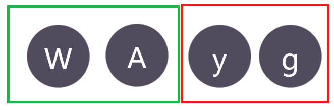 .
.
The characters in the green box are basically perfect, as they have no downward tail. Those in the red box demonstrate the problem.
I would like for all characters to be perfectly vertically centered. In the image, characters with a downward tail are not vertically centered. Is this possible to rectify?
Here is the fiddle that demonstrates the problem in full.
.avatar {
    border-radius: 50%;
    display: inline-block;
    text-align: center;
    width: 125px;
    height: 125px;
    font-size: 60px;
    background-color: rgb(81, 75, 93);
    font-family: "Segoe UI";
    margin-bottom: 10px;
}

.character {
    position: relative;
    top: 50%;
    transform: translateY(-50%);
    line-height: 100%;
    color: #fff;
}
<div class="avatar">
<div class="character">W</div>
</div>
<div class="avatar">
<div class="character">y</div>
</div>Solution
Here is my solution using JS. The idea is to transform the element into an image in order to get its data as pixel then loop through them to find the top and bottom of each character and apply a translation to fix the alignment. This will work with dynamic font properties.
The code is not optimized but it highlight the main idea:
var elems = document.querySelectorAll(".avatar");
var fixes = [];
for (var i = 0; i < elems.length; i++) {
var current = elems[i];
domtoimage.toPixelData(current)
.then(function(im) {
/* Search for the top limit */
var t = 0;
for (var y = 0; y < current.scrollHeight; ++y) {
for (var x = 0; x < current.scrollWidth; ++x) {
var j = (4 * y * current.scrollHeight) + (4 * x);
if (im[j] == 255 && im[j + 1] == 255 && im[j + 2] == 255) {
t = y;
break;
}
}
}
/* Search the bottom limit*/
var b = 0;
for (var y = (current.scrollHeight - 1); y >= 0; --y) {
for (var x = (current.scrollWidth - 1); x >= 0; --x) {
var j = (4 * y * current.scrollHeight) + (4 * x);
if (im[j] == 255 && im[j + 1] == 255 && im[j + 2] == 255) {
b = current.scrollHeight - y;
break;
}
}
}
/* get the difference and apply a translation*/
var diff = (b - t)/2;
fixes.push(diff);
/* we apply the translation when all are calculated*/
if(fixes.length == elems.length) {
for (var k = 0; k < elems.length; k++) {
elems[k].querySelector('.character').style.transform = "translateY(" + fixes[k] + "px)";
}
}
});
}.avatar {
border-radius: 50%;
display: inline-flex;
vertical-align:top;
justify-content: center;
align-items: center;
width: 125px;
height: 125px;
font-size: 60px;
background:
linear-gradient(red,red) center/100% 1px no-repeat,
rgb(81, 75, 93);
font-family: "Segoe UI";
margin-bottom: 10px;
}
.character {
color: #fff;
}<script type="text/javascript" src="https://css-challenges.com/wp-content/themes/ronneby_child/js/dom-to-image.js"></script>
<div class="avatar">
  <div class="character">W</div>
</div>

<div class="avatar">
  <div class="character">y</div>
</div>
<div class="avatar">
<div class="character" style="font-size:35px">a</div>
</div>
<div class="avatar">
<div class="character" style="font-size:25px">2</div>
</div>
<div class="avatar">
<div class="character">o</div>
</div>
<div class="avatar">
<div class="character">|</div>
</div>
<div class="avatar">
<div class="character">@</div>
</div>
<div class="avatar">
<div class="character">Â</div>
</div>
<div class="avatar">
<div class="character" style="font-family:arial">Q</div>
</div>
<div class="avatar">
<div class="character">~</div>
</div>
<div class="avatar">
<div class="character">8</div>
</div>
<div class="avatar">
<div class="character">ä</div>
</div>
<div class="avatar">
<div class="character">ç</div>
</div>
<div class="avatar">
<div class="character">$</div>
</div>
<div class="avatar">
<div class="character">></div>
</div>
<div class="avatar">
<div class="character">%</div>
</div>UPDATE
Here is a first optimization of the code:
var elems = document.querySelectorAll(".avatar");
var k = 0;

for (var i = 0; i < elems.length; i++) {
  domtoimage.toPixelData(elems[i])
    .then(function(im) {
     var l = im.length;
      /* Search for the top limit */
      var t = 0;
      for (var j = 0; j < l; j+=4) {
          if (im[j+1] == 255) { /* Since we know the colors, we can only test the G composant */
            t = Math.ceil((j/4)/125);
            break;
          }
      }
      /* Search the bottom limit*/
      var b = 0;
      for (var j = l - 1; j >= 0; j-=4) {
          if (im[j+1] == 255) {
            b = 125 - Math.ceil((j/4)/125);
            break;
          }
      }
      /* get the difference and apply a translation*/
      elems[k].querySelector('.character').style.transform = "translateY(" + (b - t)/2 + "px)";
      k++;
    });
}
.avatar {
border-radius: 50%;
display: inline-flex;
vertical-align:top;
justify-content: center;
align-items: center;
width: 125px;
height: 125px;
font-size: 60px;
background:
linear-gradient(red,red) center/100% 1px no-repeat,
rgb(81, 75, 93);
font-family: "Segoe UI";
margin-bottom: 10px;
}
.character {
color: #fff;
}<script type="text/javascript" src="https://css-challenges.com/wp-content/themes/ronneby_child/js/dom-to-image.js"></script>
<div class="avatar">
<div class="character">W</div>
</div>
<div class="avatar">
<div class="character">y</div>
</div>
<div class="avatar">
<div class="character" style="font-size:35px">a</div>
</div>
<div class="avatar">
<div class="character" style="font-size:25px">2</div>
</div>
<div class="avatar">
<div class="character">o</div>
</div>
<div class="avatar">
<div class="character">|</div>
</div>
<div class="avatar">
<div class="character">@</div>
</div>
<div class="avatar">
<div class="character">Â</div>
</div>
<div class="avatar">
<div class="character" style="font-family:arial">Q</div>
</div>
<div class="avatar">
<div class="character">~</div>
</div>
<div class="avatar">
<div class="character">8</div>
</div>
<div class="avatar">
<div class="character">ä</div>
</div>
<div class="avatar">
<div class="character">ç</div>
</div>
<div class="avatar">
<div class="character">$</div>
</div>
<div class="avatar">
<div class="character">></div>
</div>
<div class="avatar">
<div class="character">%</div>
</div>I am using dom-to-image plugin for this.
Answered By - Temani Afif Answer Checked By - David Goodson (PHPFixing Volunteer)
 Posts
Posts


0 Comments:
Post a Comment
Note: Only a member of this blog may post a comment.