
Issue
I've looked everywhere (for days..) but couldn't find a solution working for me so here I am..
I've created some sort of square, divided in 4 div, squares I all want responsive.
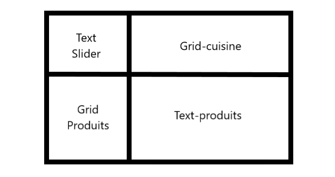
As I can't set any div heigh, I can't get the text of the "text-slider" and "text-produits" div in the center. Does anybody know how to do this ? Thank in advance!
.slider {
  display: table;
  width: 100vw;
  margin-left: calc(-50vw + 50%);
  height: 100%;
  justify-content: center;
  position: relative;
}

.slider-wrapper {
  width: 100%;
  height: 100%;
  overflow: hidden;
}

.produits {
  display: table;
  width: 100vw;
  margin-left: calc(-50vw + 50%);
  height: auto;
  justify-content: center;
  vertical-align: middle;
  text-align: center;
  position: relative;
}

@media screen and (min-width: 850px) {
  .text-slider {
    display: table-cell;
    width: 30%;
    vertical-align: middle;
    text-align: center;
  }
  .grid-cuisine {
    display: table-cell;
    justify-content: center;
    align-items: center;
    position: relative;
    width: 45%;
  }
  .grid-produits {
    display: table-cell;
    width: 30%;
    justify-content: center;
  }
  .text-produits {
    display: table-cell;
    width: 45%;
    vertical-align: middle;
    text-align: left;
    padding: auto;
  }
}
<div class="row slider d-flex justify-content-center" id="photos">
<div class="text-slider">
<div>
Nunc euismod eget...
</div>
</div>
<div class="grid-cuisine">
<div class="slider-wrapper">
...
</div>
</div>
</div>
<div class="row produits d-flex justify-content-center" id="produits">
<div class="grid-produits">
<img src="images/combo-alpha.svg" alt="..." class="image-produits">
</div>
<div class="text-produits">
Lorem ipsum dolor...
</div>
</div>Solution
You can use flexbox for this - I have commented css below:
* {
  box-sizing: border-box;
}

.container {
  display: flex;
  flex-direction: row;   /* align children in rows */
  flex-wrap: wrap;       /* allow wrapping of children for multiple rows */
  width: 50%;            /* change to width you want */
  margin: 0 auto;

  border-left: 5px solid black;
  border-bottom: 5px solid black;
}

.container>div {
  border-right: 5px solid black;
  border-top: 5px solid black;
  padding:20px;

  display:flex;          /* make children flex too for centering */

  align-items:center;    /* vertical center */
  justify-content:center; /* horizontal center */

}

.left-col {
  width: 30%;
}

.right-col {
  width: 70%;
}
<div class="container">
<div class="left-col">
top left content over multiple lines
</div>
<div class="right-col">
top right
</div>
<div class="left-col">
bottom left content over multiple lines
</div>
<div class="right-col">
bottom right
</div>
</div>Answered By - Pete Answer Checked By - Dawn Plyler (PHPFixing Volunteer)
 Posts
Posts


0 Comments:
Post a Comment
Note: Only a member of this blog may post a comment.