
Issue
I am fiddling with a larger project which involves generating a grid of square divs with arbitrary dimensions (ie of n by k square elements). These square divs are added to a grid container which in turn needs to take up 100% of the width and height of its parent (invisible here but set to 400px by 400px).
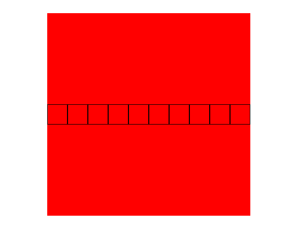
My question is this: how can I align the square divs along the cross-axis (vertically in this case) when there is more than one row of these divs. Setting "align-items: center" no longer seems to work when there are 2 or more rows as shown below. I could create a container div within the container div but that seems inelegant and I would like to avoid it if at all possible. Any suggestions for a flexbox newb? I included CSS and Javascript DOM styling below the images but I'm not sure it adds much to the problem. In the end it is just rows of columns in a display: flex context.
The CSS (most of this is javascript DOM)
 * {
  margin: 0;
  padding: 0;
  box-sizing: border-box;
}

html, body {
  height: 100%;
  width: 100%;
}

#ticTacInterface {
  background-color: red;
  width: 400px;
  height: 400px;
  margin-left: auto;
  margin-right: auto;
  margin-top: 50px;
  display: flex;

}
Excerpts of the javascript (tried to grab only relevant stuff)
let GridContainer = function(numberOfCellsX, numberOfCellsY) {

  let numberOfCells = numberOfCellsX*numberOfCellsY;
  let xCordinateOfCell = 1;
  let yCordinateOfCell = 1;
  let rowElement = [];

  // dynamically creates styling details for the container grid.
  let currentPlayerColor = gameState.getCurrentPlayer().color;
  let dimensionsX = 100;
  let dimensionsY = 100;
  this.gridContainer = document.createElement("div");
  ticTacInterface.appendChild(this.gridContainer);
  this.gridContainer.style.width = String(dimensionsX) + "%";
  this.gridContainer.style.height = String(dimensionsY) + "%";
  this.gridContainer.style.display = "flex";
  if(numberOfCellsX>=numberOfCellsY) {
    this.gridContainer.style.flexDirection = "row";
  }
  else if(numberOfCellsX<numberOfCellsY) {
    this.gridContainer.style.flexDirection = "column";
  }
  this.gridContainer.style.alignItems = "center";
  // this.gridContainer.style.alignContent = "center";
  this.gridContainer.style.flexWrap = "wrap";
  this.gridContainer.style.alignContent = "flex-start";
More javascript styling for the cell itself
  let Cell = function(width, height, color, name) {
    this.newDiv = document.createElement("div");
    // this.newDiv.style.alignSelf = 'center';
    this.newDiv.name = name;
    this.newDiv.cellState = "dead";
    this.newDiv.style.backgroundColor = "transparent";
    if(numberOfCellsY === numberOfCellsX) {
      this.newDiv.style.height= "calc(100%/" + numberOfCellsY + ")";
      this.newDiv.style.width = "calc(100%/" + numberOfCellsX + ")";
    }
    else if(numberOfCellsY > numberOfCellsX) {
      this.newDiv.style.height= "calc(100%/" + numberOfCellsY + ")";
      this.newDiv.style.width = "calc(100%/" + numberOfCellsY + ")";

    }
    else if(numberOfCellsY < numberOfCellsX) {
      this.newDiv.style.height= "calc(100%/" + numberOfCellsX + ")";
      this.newDiv.style.width = "calc(100%/" + numberOfCellsX + ")";
    }
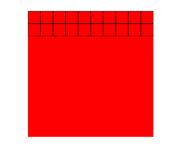
Solution
You don't want align-items...you want align-content
The CSS align-content property defines how the browser distributes space between and around content items along the cross-axis of their container, which is serving as a flexbox container.
In this case the cross=axis is the vertical one and you want the items to align center of that cross-axis.
* {
  margin: 0;
  padding: 0;
  box-sizing: border-box;
}

 ::before,
 ::after {
  box-sizing: inherit;
}

.container {
  width: 400px;
  height: 500px;
  margin: 1em auto;
  background: red;
  display: flex;
  flex-wrap: wrap;
  align-content: center;
}

.box {
  width: 80px;
  height: 80px;
  border: 1px solid black;
}
<div class="container">
<div class="box"></div>
<div class="box"></div>
<div class="box"></div>
<div class="box"></div>
<div class="box"></div>
<div class="box"></div>
<div class="box"></div>
<div class="box"></div>
<div class="box"></div>
<div class="box"></div>
</div>Answered By - Paulie_D Answer Checked By - Cary Denson (PHPFixing Admin)
 Posts
Posts


0 Comments:
Post a Comment
Note: Only a member of this blog may post a comment.